

Artnautics: /ärtnôtiks/ noun : an area of effect where nothingness hits creativity 2) an unconscious effort to explore the art world. 3) a creativity engine.4) Art and sundry. 5) A mini-Gallery of ART, Beauty, Pop Culture, and Comics (from Merriam-Webster Dictionary)
Tuesday, March 13, 2012
Self-Portrait 1889 by Vincent Van Gogh
Vincent Van Gogh (1853 – 1890) was a Dutch post-impressionist painter but the most of his time near Paris and its countryside. His self portrait circa 1889 offers an insightful glimpse into the artist's mind. The swirling background, burnt orange beard, and the use of blue for the background and foreground color (his suit) are the major elements expressing the artist's opinion of his mind. One could interpret the swirling background as confused energy or uncontrollable urges. The orange represents the realistic color of his beard and is the only other color used besides the blue. The blue could be an expression of the artist's cool, and relaxed side of his personality while the orange could express an often occuring rage. But, maybe not. Nice painting. It can be found at the Van Gogh Museum in Amsterdam, Holland.

Sunday, February 12, 2012
The Fall of Rebel Angels by Pieter Bruegel
Pieter Bruegel (1525 - 1569) was a Flemish renaissance painter and printmaker known for his landscapes and peasant scenes. The Fall of Rebel Angels shows the non-ending battle of good vs evil. The Archangel Michael is shown fighting the fallen angels as they fall from heaven due to the sin of Pride. The artist exaggerates the size of the subject based on moral alignment. So, the hero will be expressed as greater in size when drawn near the smaller depicted villain. The corrupted moral alignment is expressed in the fallen angels as half-monster and half-human. The battle is perceived as great and dramatic.


Saturday, October 15, 2011
Cityscape by Richard Diebekorn
Richard Diebenkorn seems to take the role as a
reporter. With the subject matter
revolving around landscapes and places,
the content doesn’t express an overt feeling or emotion but seems to
report the world from a bird’s eye view.
From an audience stand point, the works appears to be aerial views of
cityscapes and beach views. The artist
describes the world abstractly but the subject matter is recognizable. His descriptive type of line is the implied
line with large geometric, planar shapes.
Regarding his major works, one could infer a sense of public spaces. His landscapes and beach paintings seems to
be areas of open space and not private.
A connection between the different forms of color or mass in his works
is inferred. The implied line is used to
express a relationship with the different forms, and this seems to allow the
audience to get a sense of an close relationship between the view and the
viewer. He would seem to be an activist
but I don’t think this is the case. His
color scheme is complementary but the complementary color is separated with a
white hue(for his landscapes and figurative art) to eliminate a strong
contrast.


Sunday, August 28, 2011
The Pop Shop by Keith Haring
Keith Haring (1958-1990) was an American artist during the 1980s. He was born in Reading, Pennsylvania and studied graphic design at The Ivy School of Professional Art. He moved to New York City in 1978 and continued his interest in art at the School of Visual Arts(Wikipedia). The bulk of his works is based in graffiti and vivid iconic styled forms with a universal language. This universal language flooded the 1980’s pop culture to the extent that his art appeared to be hieroglyphs, speaking symbols without words. His most famous work and widely known design is the Radiant Baby. The Pop Shop, a retail outlet, was founded in Manhattan in 1987. It sold t-shirts, posters, coffee mugs, and hats with Haring’s designs. The store closed in 2005 but the interior was completely designed and painted by Haring. It is a continuous mural that included the walls, ceiling, and floor. It is formed by black and white colors with bold curved lines. I think having a room designed in this style could develop to a section solely devoted to Pop Culture and Art Design.


Thursday, August 18, 2011
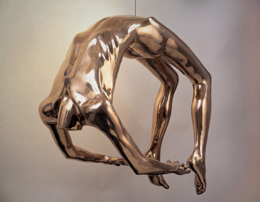
Arch of Hysteria by Louise Bourgeois
Louise Bourgeois (1911-present) was born in Paris, France in 1911. She studied painting at the Ecole du Loure and at the Ecole des Beaux-Arts. She moved to New York City in 1938 with her husband Robert Goldwater. She continued her interest in art at the Art Students League of New York. She still lives in New York. Her most famous piece is the Maman, which is a 30 foot tall spider cast in bronze(Wikipedia). The Arch of Hysteria is based on the French neurologist Jean Martin Charcot’s theory of hysteria. Charcot based his hereditary origin of hysteria on his documented studies with female patients(Charcot 32) . Charcot described hysteria as combination of physical tension, immobility of the limbs, and an extreme emotional state(Charcot 32) . It was associated with females. For Arch of Hysteria, Bourgeois chose a male figure instead of a female to counter the misconception. An item that counters traditional thinking is a necessary piece and should be acquired.

 |
| Excerpt of Jean Martin Charot's Study |
Subscribe to:
Posts (Atom)